I just recently got photoshop on my mac, so i am still a newbie to all this editing. However when i was younger i loved using photoshop and in high school we learned how to use it in art class. But that was many years ago. I'm just starting to get back into it. Photoshop is great! I love it, and I would love to learn how to use it better. When i first saw this assignment i was quit excited "Finally I can take photos, and edit them (which is my favourite!)." When many people think of editing, they think "oh I need to edit that pimple on my face before putting it on Facebook." Thank god for editing programs! These are still my first projects, there not perfect! Bare with me! =)
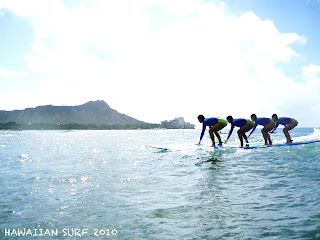
This is my main surf photo (main layer)
2nd layer
3rd layer
4th layer
EDITED:

Carrying on, my first photo is me surfing in Hawaii, February 2010. I had a friend take snap shots of me surfing. I wanted to make this photo more interesting, since I had so many snap shots. My goal is to have a main photo which is the first one below which is my main layer, and have 3 other supporting photos (which was taken "snap shot" perviously to the first photo above, scroll up and look to see me surfing to the main layer photo with Diamond Head in the back ground). I first used the magic wand featured on the Photoshop CS5, selecting my self on the surf board in all 3 of the photos (this is not including my main layer) and than I dragged them into my main layer. I assembled each one of the 3 bodies behind each other giving it an interesting effect. Also each body's opacity faded. Now to my finish touches, I adjusted the vibrance, exposure, brightness/colour. I wanted to make the water lighter (that day the sun wasn't fully out) and the sky brighter. I mainly played around with the colours until I was satisfied. Enjoy!
ORIGINAL:
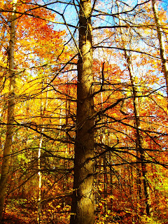
EDITED:

This photo was taken last weekend, when my whole family went up to Algonquin Park for the day. My family and I was walking down from the mountain when i realized this very interesting tree. Many people may think its an old tree with no leaves and it looks a little scary. So I took a picture of it, and i set my camera that day to my manual which I custom changed the colour shifting the contrast so that the colours of the fall season seemed brighter and you can actually see the colours. I most definitely had the best photos that day out of everyone in my family. As you can see the original photo is nice and you can see all the colours of the leaves. I captured the orange, yellow and green leaves very well and its in layers, which I thought was cool. But the main purpose of this photo was this tree. On photoshop I adjusted and added brightness, contrast, vibrance, colour balance, shadows, highlights. The edited photo is now more bold, making the tree darker and sticking out more. Also the sky is even brighter, which makes all the colours even more "collide-able". I love fall, not for the weird warm and cool weathers but the changing of nature, the scenery, the leaves, the tree, it's all so beautiful and makes it a great time to take photos! Enjoy,CHEERS!

